- Author Lauren Nevill nevill@internetdaybook.com.
- Public 2023-12-16 18:48.
- Last modified 2025-01-23 15:15.
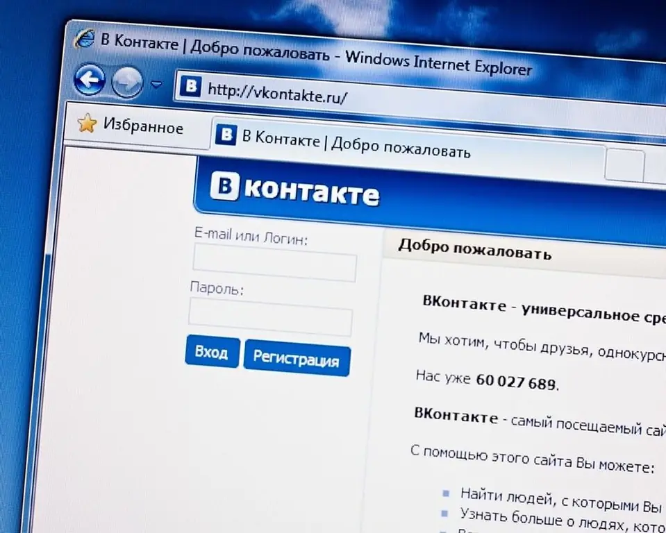
On August 17, 2016, the social network "Vkontakte" finally transferred all users to the new design. Until now, it was offered only to a part of account holders in test mode, while they had the opportunity to return the previous interface with one click. Now there is no such possibility. Is the only way out - to get used to new things? Let's reveal a secret: there are still some possibilities to return the old interface of "Vkontakte".

The old methods don't work anymore. Now that all users have been finally transferred to the new design, it is already useless to change something in the address bar or look for the coveted button on your page or in the settings, which will allow you to return the old Vkontakte interface and not waste time getting used to the new one. The administration of the social network did not leave a choice to its users. A blog entry appeared on the site explaining in detail why everyone should be happy about it. And what about those who liked the old design more?
It will not be possible to return the old Vkontakte interface completely the way it was. But you can make it look very similar to the old design. The fact is that several custom styles for the social network are currently being developed. They are still raw, but for the impatient it is better than nothing. Dissatisfied with the update, the craftsmen have already begun to create scripts for browsers, the installation of which allows you to style the Vkontakte interface to match what was before. We will not advertise anyone, search the net for information on specific custom styles. True, firstly, there is a risk of encountering malware, so if you decide to install it, update your antivirus and blame yourself. And secondly, the result of the work of "folk craftsmen" is far from ideal.
The second method is not quick, but in a certain scenario it can give a result. It is necessary in all possible ways to let the administration know that you are unhappy with the innovation. The developer let them know that the transition is final, but if the VK team sees that there really is a whole army of fans of the old style, perhaps it will make concessions. There have already been similar precedents in Runet: then Yandex reacted to the wave of indignation and returned the old interface of Kinopoisk.


