- Author Lauren Nevill nevill@internetdaybook.com.
- Public 2023-12-16 18:48.
- Last modified 2025-01-23 15:15.
Let's pay attention to the disadvantages of float. How block and inline elements behave with each other and whether to use them together. Let us analyze what a loss is and how to deal with it.

Despite the fact that in the last article we built a simple grid for the site using floats, they are originally intended to adjust the flow of elements in the text. Float has three meanings: left - the elements stick to the left margin; right - elements are pressed to the right edge; none - Wrapping mode is disabled.
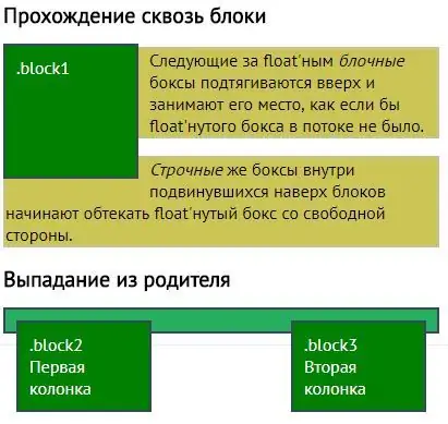
A float-wrapped element can be sized and padded, but if the element is inline it will behave like a block element.
.block1 {
float: left;
width: 150px;
}
.block2 {
float: right;
width: 150px;
}
There is another problem when using floats, which is falling out of the stream. It appears when the blocks go one after the other, but only one of them has the float property, then it will be on top of the rest, because it does not see other blocks. Inline elements will wrap around float elements, but the block containing this text will remain under the float element.

But how does float interact with float?
They behave like text: they stand one after the other as long as there is free space, and then move to a new line. Therefore, using floats, we began to build grids. If there is no space left, then they are moved beyond the width of the site, that is, they go nowhere.
If the float does not see simple block elements, then the block elements can be taught to see the float. We use the clear property, which disables wrapping from all sides (or from selected ones). That is, an element with clear will fall under the element with float.


