- Author Lauren Nevill nevill@internetdaybook.com.
- Public 2023-12-16 18:48.
- Last modified 2025-01-23 15:15.
I suggest you take a look at where Yandex began to grow. Namely, to look at how the main site of the search giant Yandex has evolved since 1998
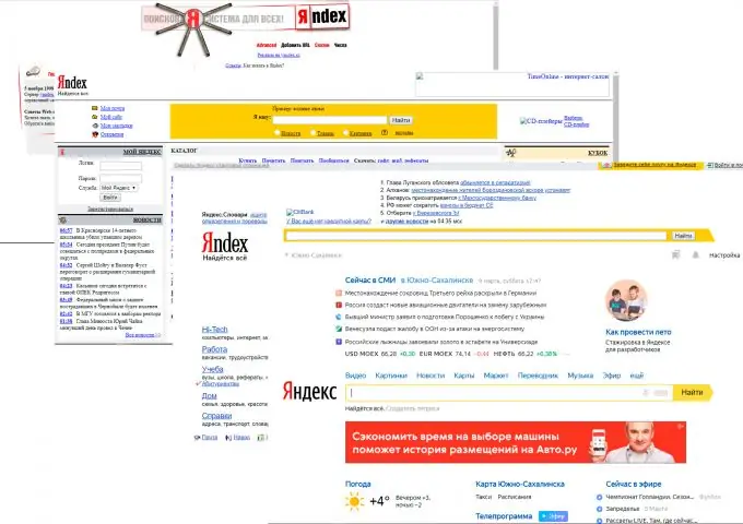
How the Yandex site changed 1998-2019 Part 1
Hello dear readers!
I suggest you take a look at how the Yandex site began to grow. Namely, to look at how the appearance of the Yandex search engine has changed since 1998.
For convenience, we will arrange this in chronological order.
1997-1998 year
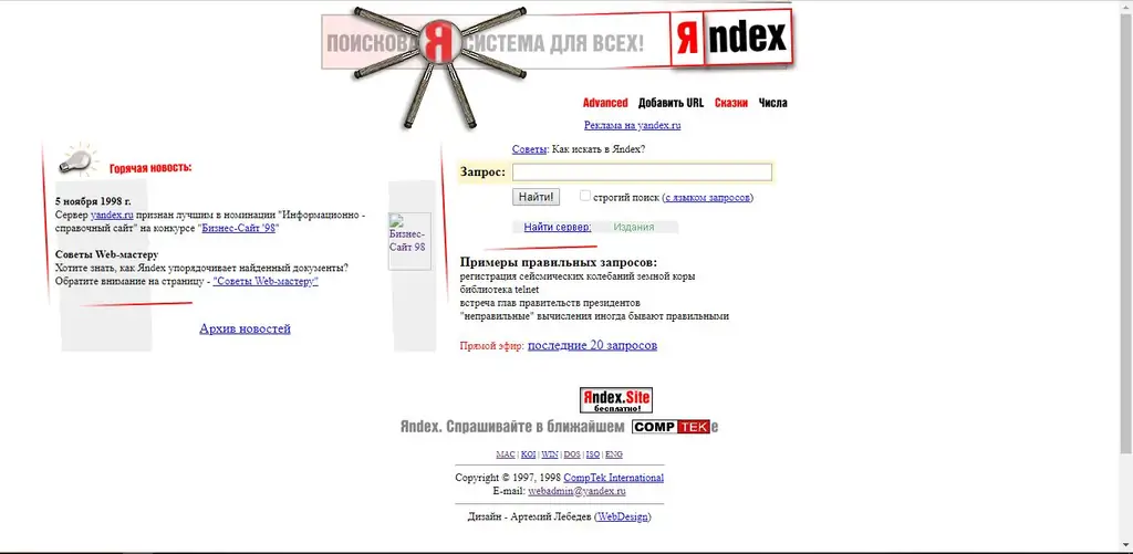
This is where Yandex began, the first site.
The first site did not have a complex structure or any animations. But in 1998 this site looked nothing at all! And not everyone had access to the Internet.
This site is not at all like today's Yandex. Yeah … Yandex has changed completely since 1998!
Go ahead…
year 2000
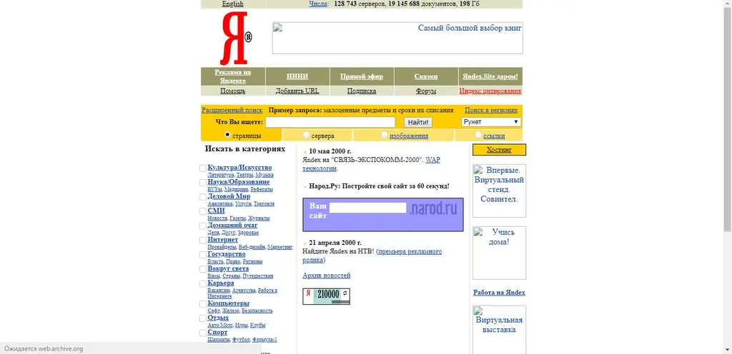
In 2000, Yandex added a characteristic detail, the search line was made yellow. The logo has changed, a simple style of the site for the year 2000.
Looking at the left side of the page, you can immediately notice that there used to be search categories. Which is not there now. Also, right on the main page there is a link to view the vacancies of Yandex itself! (In the lower right corner) Also, earlier Yandex offered users to create their own website.
year 2001
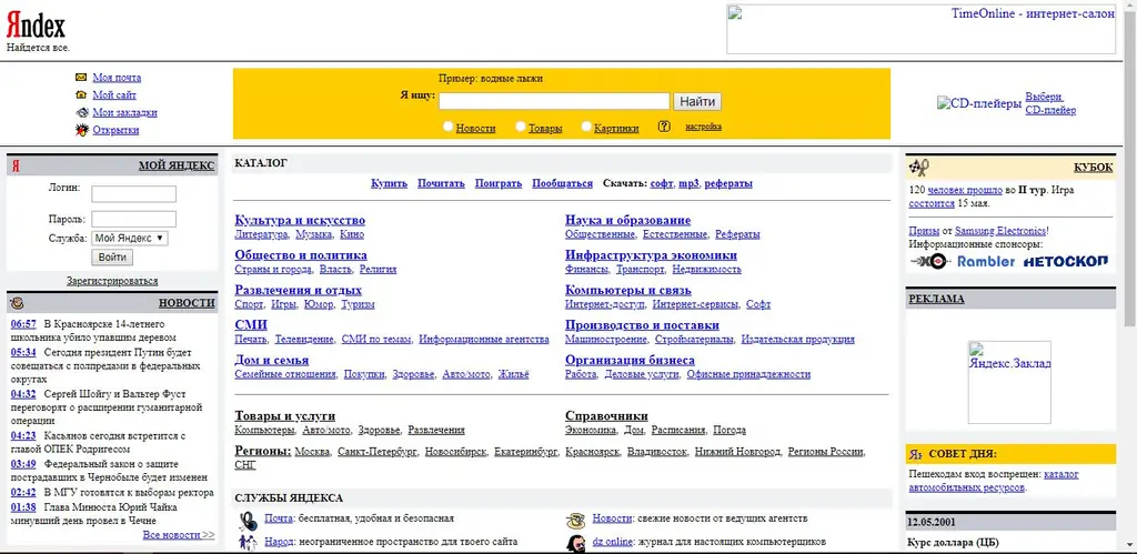
So, let's imagine that it's 2001, we go to the Internet and drive in Yandex and see such a site! In 2001, the site began to adapt to the size of the screen. Received a wide format. Added simple icons for some elements. You may notice that earlier Yandex services were called services. It is also now possible to register with Yandex! Also, you can see that the logo has been changed and moved to the top. Now we see the word Yandex and under it the popular slogan "There is everything!"
2002 year
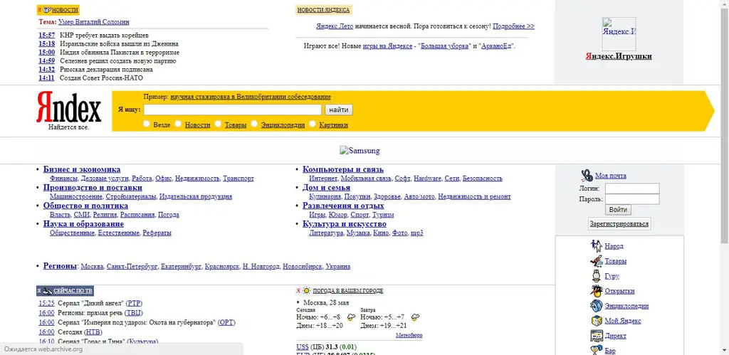
So, now our Yandex has begun to acquire modern features. The logo was moved to the left of the search bar. News, poster and other features are already present. Also, the search line has become not a square shape, but the shape of an arrow to the right. But still, this is still far from the current site!
2005 year
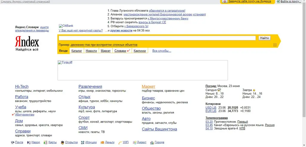
In 2003-2004, the site did not change much. But in 2005 we can notice changes in the font of the site. From now on, Yandex uses sans-serif fonts (Sans serif) And at the top we will see a small gray strip with an excuse to make Yandex search by default. And also on the right on the same strip there is a link to register mail and a link to enter the mail. Also, the page layout has become more convenient and more understandable.
As you can see, the site began to display the modern features of modern Yandex. But that's not all!
In the second part, we will continue our journey through time with you! And let's see how Yandex has changed. Subscribe to me not to miss even more interesting articles:-)


