- Author Lauren Nevill nevill@internetdaybook.com.
- Public 2023-12-16 18:48.
- Last modified 2025-01-23 15:15.
Website development is an interesting, creative, but also responsible occupation. After all, you should take into account not only your own preferences, but also the impact that the site design will have on future visitors. Will the page attract customers and readers, or will they want to close it after a while? This largely depends on the color scheme in which your site will be sustained. How to choose it correctly, especially if you are not constrained by the framework of an existing corporate identity?

Instructions
Step 1
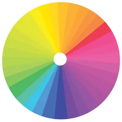
Think about what kind of impression you want to make with the help of your site, what associations to evoke? This will help you determine if you want to use warm or cool colors.
If you need associations with home comfort, positive emotions, pleasant sensations, it is better to use warm colors. If you want to create an impression of calmness, reliability, seriousness - cool colors are at your disposal.
Step 2
Let's take a closer look at the impressions associated with different colors. Blue evokes a feeling of stability and calmness. It goes well with shades of light gray. Often used for serious corporate websites, banking or municipal institutions. Green is the color of life, growth, optimism. In combination with shades of yellow, it can often be seen on sites dedicated to the sale of plants, flowers, home and garden items. It is also appropriate for resources dedicated to children and school. Red, as a rule, is associated with passion, aggression, activity. It is suitable for a resource dedicated to, for example, sports or sports goods, as well as an information page for a bar or nightclub. A site entirely in bright red will irritate the viewer's nervous system. Therefore, it is better not to make it the main color, reduce its saturation, or darken it. Yellow has a special property: it creates a sharp contrast with most other colors. Therefore, for web design, it is rarely used in its pure form. But light yellow or golden yellow are quite acceptable for sites related to children's goods, household goods, food.
Step 3
Whatever color scheme you choose, take care of the eyes of future visitors to your resource. Do not make too bright and saturated color predominant on the site - it will be unpleasant and tiring for the eyes. Do not combine colors that create a sharp contrast with each other. Also, avoid animated or too colorful backgrounds.


